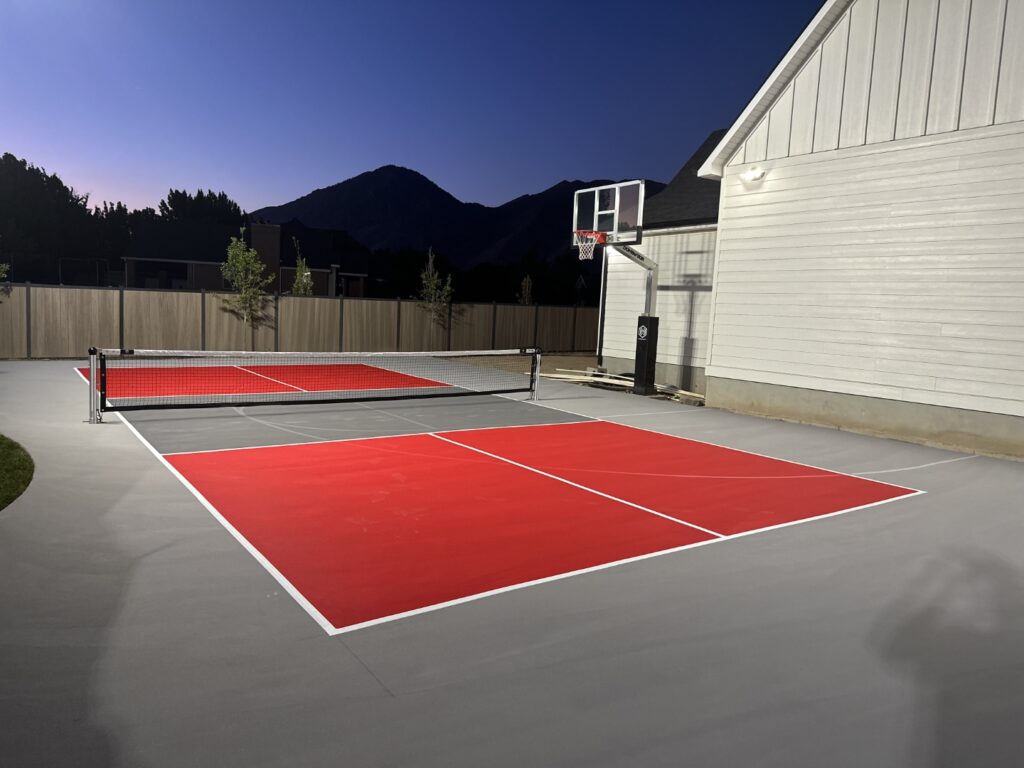
When designing or renovating a court, whether for basketball, tennis, pickleball, or a combination of sports, court design is about more than aesthetics; it can influence performance, perception, and even safety. The right combination of colors can turn your court into the perfect space to host games.
Why Color Matters on the Court
Color plays a subtle but impactful role in how athletes perform, how spectators experience the game, and how visitors perceive your facility. Strategic color choices can:
- Enhance the visibility of lines, balls, and players.
- Improve focus and reduce fatigue.
- Influence mood and energy levels.
- Reinforce branding and identity.
Let’s break down each color and what it can bring to the court.
Red: Energized Play
Red encourages energy, action, and feelings of aggression. It’s a high-intensity color often associated with strength and speed. It works best for highlighting key zones, such as the important areas on a basketball court, or energizing players and fans. It also works well in places where players must use greater physical force.
Approach this color with caution, as red can be overstimulating in large areas, potentially increasing anxiety or tension.
Blue: Cool Control
Blue promotes a sense of calm, focus, and precision. It’s a popular choice in tennis and basketball courts because it contrasts well with common ball colors. It also helps players remain effective throughout the game and not falter in difficult situations.
This color works best for full-court surfaces, especially in indoor environments, because blue courts are easier on the eyes under bright lighting. It’s also a good choice for encouraging a cool-headed play style.

Green: Natural Balance
Green provides a soothing, refreshing feel — helping people feel balanced and connected to nature. Most tennis courts are painted this color, so they can blend seamlessly with outdoor landscapes. Like blue, it can help players feel calm and focused. This color works best for outdoor courts, community parks, or facilities that prefer a timeless, natural aesthetic.
Green is easy on the eyes, especially during long games or practice sessions. However, it could make it difficult to see the ball on extremely sunny days.
Yellow & Orange: High Visibility
These bright, energizing colors work perfectly for accents and boundaries. They boost visibility, especially under poor lighting or against darker surfaces, and contribute to a positive atmosphere. This color works best for line markings, logo elements, and any areas you want players to focus on quickly. Use yellow and orange sparingly to avoid visual overload.
Black & Grey: Sleek Sophistication
Black and dark greys give a court a modern and dramatic feel. They create a bold, professional look and can be used to frame the court or define boundaries. They can also reduce glare, create good contrast with balls, and enhance focus.
Use black and grey in logos, branding zones, or as contrast elements to brighter colors. If you want to use a fair amount of these colors, keep in mind that dark surfaces absorb heat quickly and may not be the best for outdoor courts.
Purple: Unconventional Confidence
Purple is rare but starting to rise in popularity. It conveys a sense of creativity and ambition and works well in courts that want to be unique, make a statement, or reflect community values. Consider using this color in branding-focused facilities or youth centers where individuality and fun play important roles.
Choosing Your Court’s Colors
Here’s how to build a court color scheme that performs:
Start with functionality — Prioritize visibility and contrast. The court lines should pop, and boundaries should be clearly defined.
Balance bold with neutral — Use one or two primary colors and balance them with neutral tones like grey or white.
Reflect your brand — Incorporate school or team colors strategically if building a community court or wanting to show pride for a team in your own personal court.

Test with lighting — View color samples under the actual lighting conditions of your court, so you can get an idea of how they will affect the playability and enjoyment of games.
Paint with Purpose
A court’s color palette not only affects the aesthetics of the space but also the performance of the players. The right colors can boost focus, enhance visibility, and even influence how players feel. Whether you’re designing a court for a competition, recreation, or community engagement, be smart and strategic about the colors you pick. A well-chosen palette doesn’t just look good — it plays smart.
Need help creating a palette that works as hard as your players? Pickle Court Surfacing can help bring your vision and style to life.

